SPOILER ALERT: I will most certainly be SPOILING.
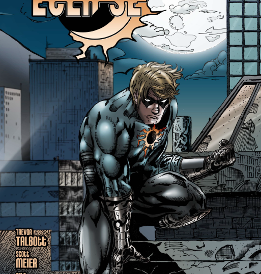
Eclipse #1 is a comic brought to you, by you! Funded by Kickstarter, this ambitious original comic is brought to you by writers Trevor Talbott and Scott Meier, supported by the artists Jessica Jimerson and Peter Raymond.
At first glance, the character design for the character Eclipse lacks any real captivating hook. No costume element, shape, or color really makes him stand out memorably from other distinct designs such as Daredevil, Moon Knight, Iron Fist, Batman or even his famous sidekicks. Without the rich history or complex lore of any of the Robin’s from DC’s Bat-Family, Eclipse comes off like a run of the mill, street-level vigilante. Perhaps most noteworthy is that his face resembles that of actor Aaron Eckhart who portrayed Harvey Dent in Warner Brothers, Dark Knight Trilogy.
The choice of brighter colors for the flashback was good, although it seemed to reveal some confusing anatomical choices. These were not, however, the most distracting visual aspect of the issue.

The layout of a few pages leaves the eyes scrabbling for some sort of visual flow. The most confusing of these layouts actually seems to be homage to Scott McDaniel’s work on Nightwing, or Todd McFarlane’s work on Spiderman. However, the lack of scale or logical movement robs the page of the desired effect.
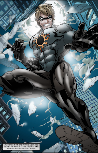
This does not mean that the art has no merit, as it is clearly stylized and feels very solid, with a sort of 2.5-D feel to the depth of each panel.
Judging by the gritty internal monologue, one might see this character as a kind of superhero cliché. This may be true for the present day hero, but it works very well for the angst filled teen during the flashback. What I found to be both refreshing and original is the origin of the heroes strength not being a boon from tragedy, but from a life of necessity. The adversity that creates Eclipse’s backbone casts his father’s natural innocence and naivety in an even greater light. The inversion of the father and son is a brilliant device that leaves you wondering where the father is now.
 In a surprising theatrical twist, the second half of the comic is actually told from the point of view of the villain, a man known as Raze. While traditionally comic book villains are evil, Raze, for all of his philosophical and pandering monologue, comes off as one-dimensional. This isn’t to say that he is completely devoid of interest, just that his needless cruelty and ruthlessness damages the thug-turned-boss feel that the writer’s were trying to build.
Most successful in this second half of the issue is the revelation that Eclipse’s symbol is actually Raze’s own, presumably from some unit that he was once the leader of. Instantaneously, this adds interest to the lackluster character design. I cannot think of a single super hero or vigilante who wears his enemies’ symbol, making Eclipse unique in yet another fashion. The comic ends focusing on a breastplate that brings to mind a kind of modernized Greek centurion’s breastplate, perhaps hinting that Raze is more than meets the eye.
All in all, this was not a bad comic. The cliché and somewhat meandering monologue gets the job done, but lacks the subtlety that veterans in the industry employ when they let the image speak for itself. The art, though a bit rough, still shows promise and talent that can only really be gained through experience. A solid try that would almost certainly develop into strong title, I hope to see this fan funded first issue avoid being eclipsed by the major players in the industry.
My rating: 3/5


sounds like a pretty decent (albeit generic) superhero comic. might be worth checking out.
Eclipse is now available on DriveThruComics.com! http://comics.drivethrustuff.com/product/125793/Eclipse