
Story and Written by Ruben Romero and Bob Salley
Pencils by Alessandro Miracolo
Inks by Raffaele Semeraro
Colors by Dennis Lehman and Rian Tags
Letters by HdE
We live in a world full of rich history and established stories that have been classic since the day they were written. Three Swords is a Three Musketeers story that is crafted with a clear love of the original but also with the drive to be different and add a certain flair that can only be brought by a fan of the original. With a property as famous as the Three Musketeers there is a certain feel that must be captured to keep the essence of the story. Three Swords doesn’t just capture the feel of the original; it embeds it into character structure while it revitalizes the story, making the musketeers familiar while having the story become fresh and new. Salley and Romero are clearly fans and have set out to do justice to the original, for which they very successful. When dealing with these characters there are some strict lines that must be followed. I happen to feel that Three Swords is a perfect balance between the original feel of the characters and the balance of a new storyline because the characters have their trademark personalities but the story is original enough that it feels new.
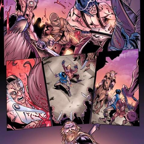
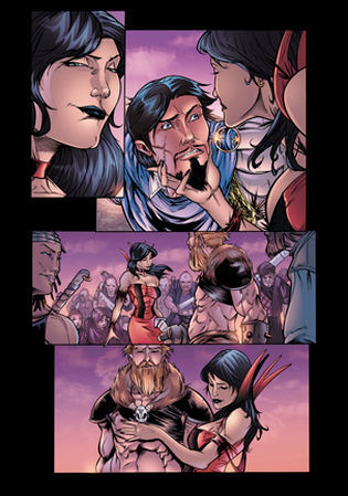
Part of what makes this comic feel so new is the truly amazing art. Miracolo and Semeraro have taken these established characters and much like the writing they have reinvented them to make them their own. Not to sound like a broken record but the reinvention is done so well because the core character aspects are still there while the new parts of the characters are original. Everyone knows that Porthos is debaucherous one of the group but the way this art team introduces us to him is picturesque and exactly what I would expect from Porthos. I truly love this style of art, to me it’s exactly what comic books should look like. All of the characters are embodied perfectly, all of the backgrounds are believable, and the color from Lehman and Tags pops with perfection and only adds to the overall excellence of the art. The art in Three Swords is certainly a feature that helps make this timeless classic fresh again.
Not sure what else I can say about HdE that I haven’t said yet, but man, he is masterful. From the first credit page, to the captions, to the dialog balloon fonts, HdE puts the final touches on this book like a great wax job on a Ferrari. Without HdE I’m not sure this book would look as good as it does, he compliments the art with his lettering so well that it almost becomes a part of the art. The credit page is done at font that looks like it belongs in the 1600’s and it sets the tone for the rest of the book. Without the credit page it would still be amazing but the way it delivers the feel and tone, I just don’t see other letterers capturing the feel so fast.


