DC’s New 52 reboot has reaffirmed the power that visual storytelling has in comic books. Sadly, they didn’t do this by putting artists with distinctive styles or remarkable craftsmanship on their titles. For the most part, the line has relied on forgettable, disposable, semi-coherent (if coherent at all), and just downright ugly artwork. For every Yanick Paquette or Cliff Chiang, creators who bring distinct sensibilities that serve the stories they tell, there’s two Harvey Talibaos or Joe Bennetts turning out barely readable pages. This hasn’t been helped by the dull, brown and gray color palette that is seen across the line week after week. It’s that whole “house style” problem that has always existed in the Big Two (and Image Comics), subsuming the artist to the product and the product to the marketing. Rather than bringing cohesiveness, DC is celebrating mediocrity. Just look at the two-page, triumphant ads for Before Watchmen they’ve placed in their comics, quoting from MTV that it’s “an unqualified success.” (Easily qualifiable; but commercially it is ethically and artistically a debacle).
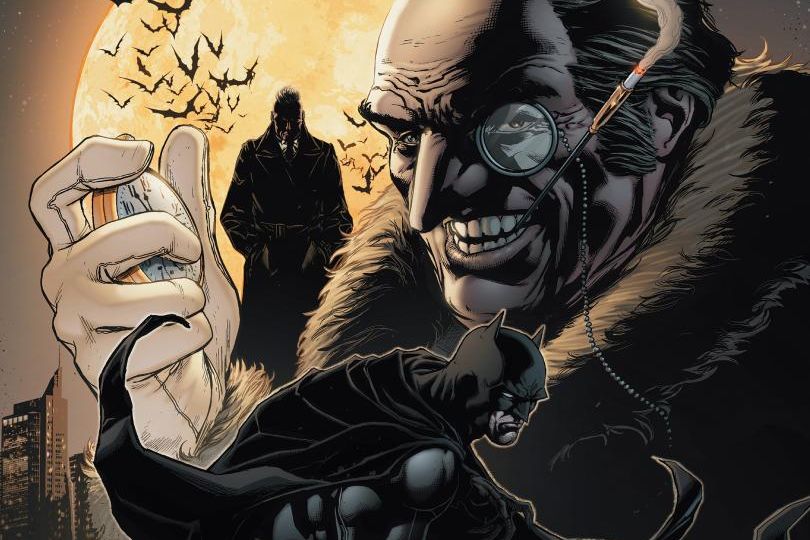
 Detective Comics #13, the first issue from new creative team, John Layman (Chew) and Jason Fabok (Soulfire), is a comic that exists somewhere on the perilous edge of this trap. Fabok is better than many of his peers at clear storytelling–though one panel seems more fixated on Penguin underling Ms. Bird’s skirt than anything else in the image–and even gives his Batman a shadowy menace while avoiding the stylistic excess of David Finch’s Batman: The Dark Knight, but it’s also very sparse. The streets and tenements where where Batman and the various criminals fight show no signs of life: no people on the street, no graffiti, no parked cars, nothing to indicate that Gotham is anything but a sound stage. By contrast, look at Miller and Mazzucchelli’s Year One or Batman Incorporated #3, where we get to see Gotham as a vibrant entity where people have lives beyond background fodder for a Batman comic book (the hookers and junkies of the former, the school kids and blue-collar workers of the latter). None of that exists in this issue. There’s grit, peeling walls, and weathered brick, certainly, but it’s as if this happened because of disuse rather than misuse. Fabok’s dirtiness is sterile.
 Even the scenes of bone-breaking violence seem casual, where thugs look only-mildly surprised as their arms and legs are suddenly bending the wrong way in excruciating pain. The back-up strip, drawn by Andy Clarke, shows a bit more of the impact of Batman’s fights, though it still has the problem of a rather lifeless Gotham.
Fabok’s style also doesn’t mesh well with the more humorous take Layman strives for in dialogue and narration: between having Bruce Wayne assuage his guilt over all the injuries he gives as Batman through charitable contributions to hospitals, the repeated reminders from Alfred to not forget the opening gala of a medical wing named after his mother, and Nightwing interrupting the kind of detective exposition Batman is prone to with “Okay, okay. I stopped listening five minutes ago,” it’s apparent this issue is not meant to be the grim-dark moodiness of the Finch title or of Scott Snyder and Greg Cappullo’s Batman. Yet Fabok shows no sign of being on the same wavelength with Layman as Rob Guillory was on Chew (notably, Guillory stuffed Chew’s backgrounds with all manner of personal touches). Even for the montage of devil-masked assassins unable to find Bruce Wayne (who they were hired to kill by Penguin), there’s a refusal to play off the obvious humor of the situation, which I suspect Grant Morrison’s Batman Inc. collaborator Chris Burnham would’ve turned into a great visual gag. (Speaking of, I wonder if Layman will be allowed to use Bat-Cow? That’s something that would be right up his alley.) Fabok isn’t terrible, just unwilling to take chances. If he can show more creativity than the bare bones treatment he’s given this issue, Detective Comics could soar.